-
Changing RCF's index page, please click on "Forums" to access the forums.
You are using an out of date browser. It may not display this or other websites correctly.
You should upgrade or use an alternative browser.
You should upgrade or use an alternative browser.
The Gold is Golder: New uniforms to come?
- Thread starter ajz20
- Start date
sailfish
The 52 year drought is over!
- Joined
- Aug 23, 2006
- Messages
- 6,939
- Reaction score
- 5,957
- Points
- 113
Those are cool! I don’t care for the current uniforms and would love to see a change. The throwbacks they wore this past season, including in the season ending loss to Atlanta, were also very popular.
I’m down with this rebrand..
Huber.
Adrninistrator
- Joined
- Feb 22, 2008
- Messages
- 21,391
- Reaction score
- 17,184
- Points
- 123
Not a fan of the Scot-Irish Appalachian heritage night jerseys?It literally doesn’t matter anymore. Every team has like 17 different jerseys…
Last edited:
sailfish
The 52 year drought is over!
- Joined
- Aug 23, 2006
- Messages
- 6,939
- Reaction score
- 5,957
- Points
- 113
There’s nothing wrong with those, but the Cavs changed their colors in 2010 to a darker red and more of a true yellow. As this site attests, the Cavs have worn ALOT of different uniforms over the years:I never understood what was wrong with these? All down hill after them. Give me proper gold.
View attachment 9989
View attachment 9990
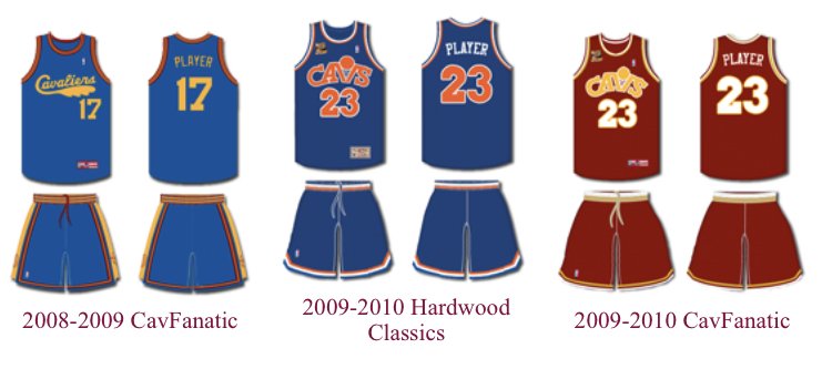
It’s kinda strange to see a franchise change not just their uniforms, but also their colors so many times. While I grew up with the Price/Daugherty/Nance Cavs during the late 80’s/early 90’s, I prefer the wine & gold look. That said, my favorite uniforms of all those are probably these:
1) 2008-09 Hardwood Classics (yellow)
2) 2015-16 Hardwood Classics (yellow)
3) 2021 Moments Mixtape City
4) 2010-17 Road
Personally, I’m not a fan of blue becoming part of our uniform, even as an accent color, when our colors are wine & gold. Black goes better than blue as an accent IMO. If they want to wear blue or orange throwbacks occasionally, go for it, but let’s stick to what we are and try to create an identity. It just feels like the Cavs have been and are all over the place uniform-wise.
Last edited:
cabs
All-Star
- Joined
- Jan 3, 2018
- Messages
- 6,677
- Reaction score
- 8,789
- Points
- 113
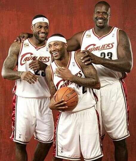
Wasn't a huge fan of the 2010-17 road, very much preferred the 2003-2010 look.There’s nothing wrong with those, but the Cavs changed their colors in 2010 to a darker red and more of a true yellow. As this site attests, the Cavs have worn ALOT of different uniforms over the years:
It’s kinda strange to see a franchise change not just their uniforms, but also their colors so many times. While I grew up with the Price/Daugherty/Nance Cavs if the late 80’s and early 90’s, I prefer the wine & gold look. That said, my favorite uniforms of all those are probably these:
1) 2008-09 Hardwood Classics (yellow)
2) 2015-16 Hardwood Classics (yellow)
3) 2021 Moments Mixtape City
4) 2010-17 Road
Personally, I’m not a fan of blue becoming part of our uniform, even as an accent color, when our colors are wine & gold. Black goes better than blue as an accent IMO. If they want to wear blue or orange throwbacks occasionally, go for it, but let’s stick to what we are and try to create an identity. It just feels like the Cavs have been and are all over the place uniform-wise.
The 2018 city was the worst ever, total abomination. I rather they just stick to wine and gold going forward and do away with the random colours which are purely for sales.. but I doubt I will get my wish.
Dr. Claw
Loves Cold, Hates Heat
- Joined
- Jun 1, 2012
- Messages
- 4,817
- Reaction score
- 5,511
- Points
- 113
these jerseys need to be back in the rotation as long as Garland/Mobley/Allen are on the team. At least once. Besides the Blue/Orange era (my favorite because that was the beginning of my Cavs fandom), these are the era of uniforms I think most recognizable as "The Cavs".I never understood what was wrong with these? All down hill after them. Give me proper gold.
View attachment 9989
View attachment 9990
I didn't mind the return of Blue/Orange for the city, really loved the "Earned" jerseys given to the Cavs as a "gift" for making the playoffs the year prior, and the mixtape jerseys were great.
But these need to come back. This is Cavs basketball right here.
I-77 NORTH
Gold Star Member
- Joined
- Apr 16, 2010
- Messages
- 1,607
- Reaction score
- 1,819
- Points
- 113
I’ve never really been a fan of our current Uni’s that we’re introduced in 2017. The ultra-futuristic look just never did it for me.
I’m also in the minority as well. Unless executed properly, the wine and gold color scheme never appealed to me. It’s outdated and very 70’s like.
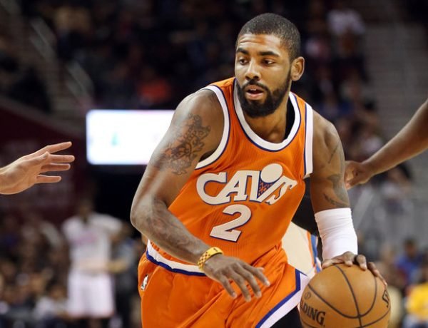
I would be open to the orange and blue color scheme coming back as our primary colors. It’s refreshing and it just represents a certain time where the Cavs moved downtown and started a new journey.
I would welcome a new journey with these young kids and without Lebron and another blue/orange refreshment.
sailfish
The 52 year drought is over!
- Joined
- Aug 23, 2006
- Messages
- 6,939
- Reaction score
- 5,957
- Points
- 113
For me the 2017 City edition were the worst...grey with black & gold trim. Those are Pittsburgh colors! Not sure what the thinking was there?Wasn't a huge fan of the 2010-17 road, very much preferred the 2003-2010 look.
The 2018 city was the worst ever, total abomination. I rather they just stick to wine and gold going forward and do away with the random colours which are purely for sales.. but I doubt I will get my wish.
I liked the simplicity of the wine road uniforms from 2010-2017. The current uniforms are just weird...the blue doesn't fit, the piping sucks, and they tried to be clever with the shape of the numbers. Honestly, I think the current uniforms are the worst since the Shawn Kemp days with the blue sash/splash thingy.
The blue & orange look was always too similar to the Knicks IMO. Now the Thunder have that color scheme too. The wine & gold is at least original. It's the same type of color scheme that Florida State and Iowa State uses.
Ohioplayer00
NBA Starter
- Joined
- Nov 13, 2020
- Messages
- 3,670
- Reaction score
- 2,946
- Points
- 113
Exactly! This uniform change has gotten out of control! There really isn’t even any team colors anymore! The fan base literally can’t connect with its team! Turn on a game on TV and only way you can tell who is the home team is looking for the logo at center court.It literally doesn’t matter anymore. Every team has like 17 different jerseys…
I know I’m too old school but I miss the days of being able to identify a team in a game right away by looking at their jersey.
Rubber Rim Job Podcast Video
Episode 3-14: "Time for Playoff Vengeance on Mickey"
Rubber Rim Job Podcast Spotify
Episode 3:14: " Time for Playoff Vengeance on Mickey."


